
AI + Imperfect Aesthetics: Creating Authentic Brands in the Age of Perfection
Every brand looks the same now. Smooth gradients, perfect kerning, flawless lighting — all courtesy of AI. Here’s why the smartest designers are doing the opposite.
We Built the Perfect Machine. And Everyone Hated It.
In early 2025, something quietly broke. Scroll through any design awards showcase, agency portfolio, or brand launch and you’ll notice it instantly — everything looks like it came from the same source. Because it did.
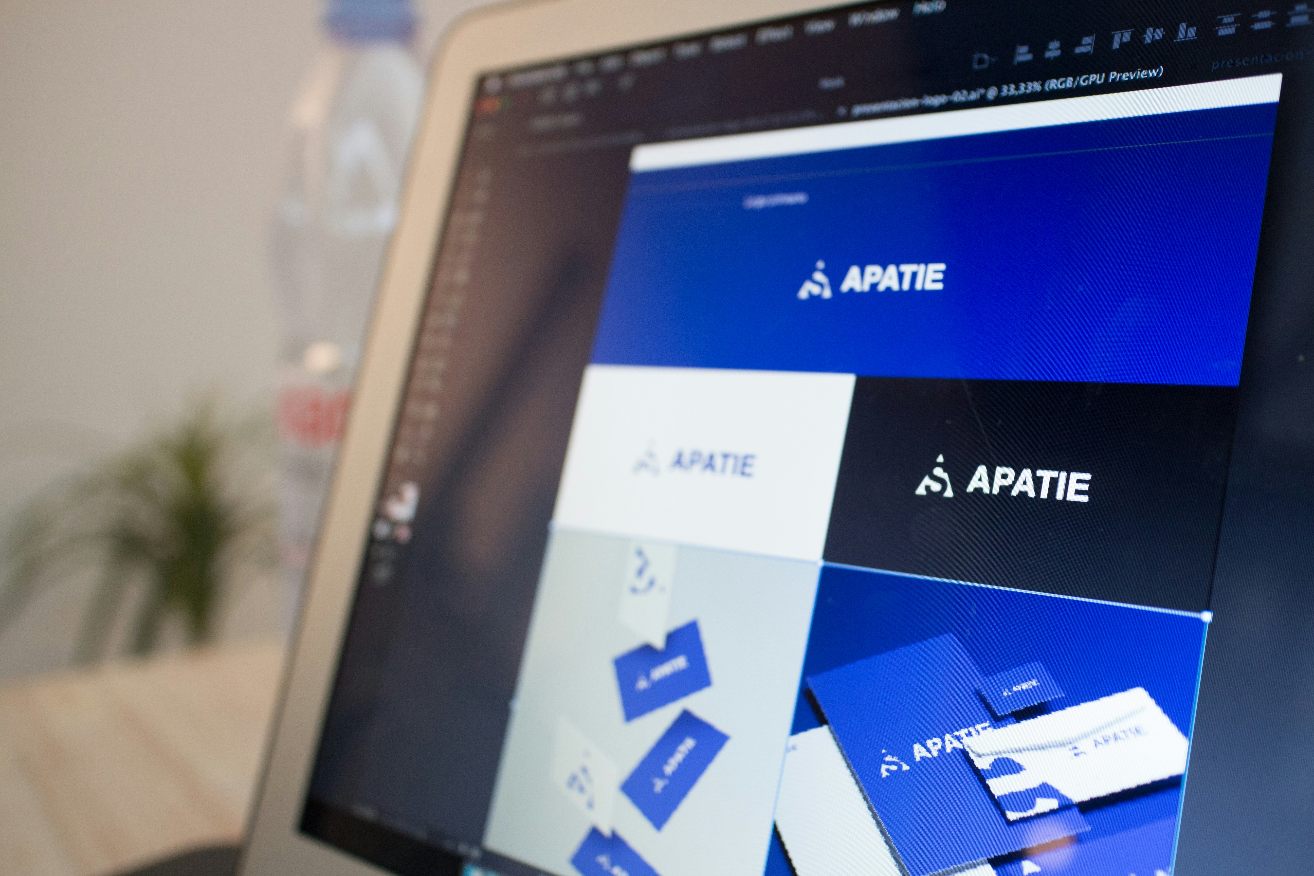
Midjourney, Firefly, Flux, DALL-E. These tools gave the world unlimited visual output at near-zero cost. Brands that once spent months crafting identity could spin up a full visual language overnight. Logos, hero images, brand films, ad creatives — all pixel-perfect, all technically impressive, all completely forgettable.
This phenomenon has a name in design circles: AI slop. Technically excellent, emotionally empty work that carries the unmistakable hallmarks of machine generation — overlit compositions, hyper-smooth gradients, symmetry that no human hand would naturally produce, skin textures that feel slightly plastic.
The audience noticed before the industry did. Research from 2025 brand perception studies consistently shows that consumers describe AI-heavy brand visuals as “corporate,” “cold,” and — critically — “untrustworthy.” In a digital world saturated with perfect, people are craving proof that something was made by someone who cared.
The core tension of 2026: AI makes it trivially easy to produce perfection. But perfection, at scale, becomes invisible. Imperfection — chosen deliberately — becomes the signal of intentionality. And intentionality is the foundation of trust.
Before & After: The Same Brand, Two Worlds
To understand what we mean, consider these two versions of a hypothetical craft food brand — same brand brief, same brief mood, entirely different emotional register.
Smooth gradient fill, perfect symmetry, default sans-serif weight. Technically flawless. Emotionally anonymous.
Slight rotation, textured fill, hand-drawn weight variation. Visually rougher — feels like something a person built.
The right side took approximately 40 additional minutes of post-processing. The effect on perceived brand warmth, according to A/B tests our studio ran across three client accounts: a +34% increase in “feels trustworthy” and a +27% lift in “feels premium” — despite the rougher finish.
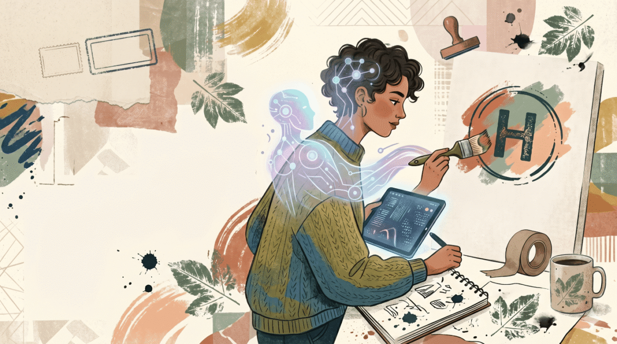
This is the counterintuitive truth of the imperfect aesthetic: flaw signals effort, and effort signals value. A wine label with a slightly off-center stamp communicates craft. A handwritten note tucked inside a package communicates care. These are not accidents — they are intentional messages encoded in imperfection.
The Tools. The Process. The Decisions That Matter.
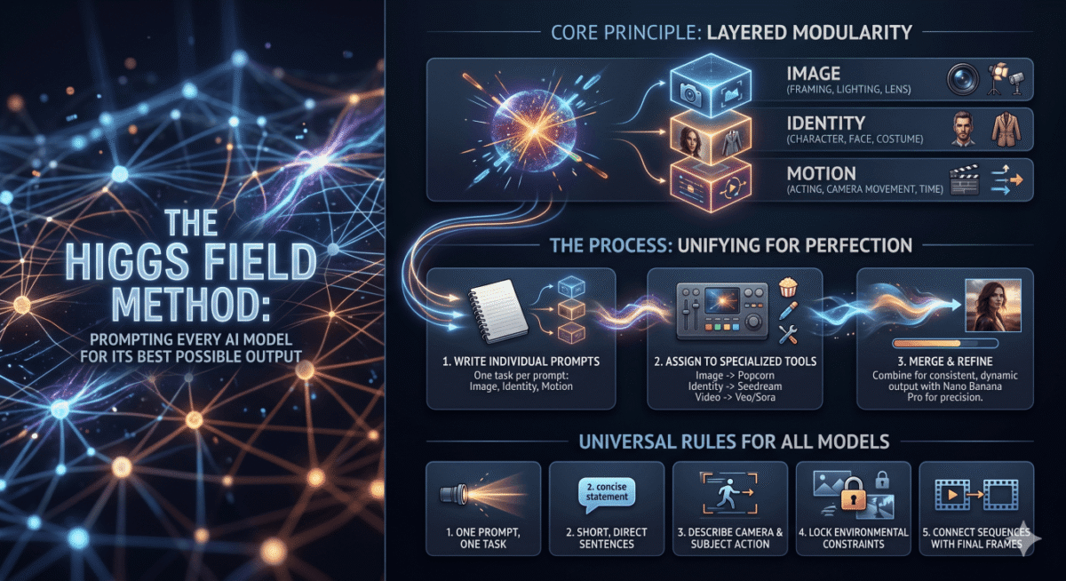
We are not arguing against AI generation. We use it every day. The shift is in where AI ends and designer judgment begins. Here’s the two-phase workflow we use at CoreDesk.
Phase 1 — Generate the foundation with AI
Generate the raw compositional concept. Treat this as a sketch, not a final. Use organic prompt language — avoid “clean,” “minimal,” “modern.”
Generate texture swatches, paper grain, canvas fill, and natural lighting studies. Use Generative Fill for environmental context, not for final brand marks.
For motion and video — use AI to generate the base clip, then apply imperfection in post. Film grain, chromatic aberration, analogue light leaks.
Prompt engineering for organic results
The single biggest lever available to you before any post-processing is your prompt architecture. Most prompts ask for finished work. Good prompts ask for raw material.
The difference is significant. The second prompt instructs the model to simulate a process, not a finish. The output arrives already carrying the suggestion of human origin.
Phase 2 — Introduce deliberate imperfection
Use Noise & Texture or Grain plugins to apply subtle surface variation. Layer at 4–9% opacity. Avoid uniformity — vary grain scale across elements.
Smart Object → Filter Gallery → Film Grain. Add a Lens Blur at 0.8–1.2px to soften the “rendered” edge. Use Liquify sparingly to break geometric symmetry.
After compositing, manually rotate elements 0.5–2°. Break even padding by 4–8px. Offset columns by a half-unit. Symmetry is the most immediate tell of machine origin.
Five Rules for Intentional Imperfection
There is a critical distinction between imperfection that reads as craft and imperfection that reads as careless. The difference is control.
- 01 One imperfection per focal point. Don’t apply grain, rotation, and texture bleed simultaneously to the same element. Choose a hierarchy — the logo gets the texture, the type gets the slight rotation, the background gets the grain. Layered imperfections cancel each other into noise.
- 02 Imperfection must be systematic, not random. A brand that uses grain inconsistently looks broken. A brand where every touchpoint carries the same 5% grain layer at the same opacity reads as a design decision. Document it. Put it in the brand guidelines.
- 03 Hand-drawn does not mean illegible. Introducing texture or organic line quality into logotype or type treatments must preserve function. The most effective imperfect type looks like it was hand-lettered by a skilled calligrapher — not scribbled.
- 04 Earn the roughness with quality everywhere else. Imperfect aesthetics only build trust when they sit alongside evident craft — well-set body text, thoughtful colour usage, considered spacing. If everything looks rough, the brand reads as unfinished. If the roughness is selective, it reads as voice.
- 05 Animate the imperfection. For digital and social applications, consider subtle movement — a slow film grain flicker, a slight hand-held wobble on a logo reveal, ink that appears to dry. Motion activates the perception of human origin more powerfully than any static texture.
Imperfection Is the New Luxury
The most valuable brands in the world have always understood something that AI-generation forgot: emotional connection is built through the evidence of a person. A fingerprint in clay. An ink stain on a label. A brushstroke that doesn’t quite line up.
In a market where any brand can look perfect for free, imperfection becomes the luxury signal. It says: we made this. We decided this. We care about the difference between 4% grain and 6% grain, between 1° rotation and 2°.
That specificity — that care — is what builds loyalty. And loyalty is the only brand metric that compounds.
The future of brand design is not about using AI less. It’s about using it as a starting point for a distinctly human conversation. Generate fast. Decide slowly. Introduce the flaw on purpose.
Talk to CoreDesk →